Showing posts with label Exhibitions. Show all posts

Saturday, October 7, 2017

Face the Music - Exhibition Opening


Here a a few photos from the opening of my exhibition Face the Music. I would love to thank all the friends, family and music fans who dropped by to check it out.


The exhibition runs until the 9th of December 2017 at Sweets Workshop Gallery in Sydney, Australia. Shop 4, 58-60 Carlton Cres, Summer Hill 2130. If you can't physically make it in to check out the exhibition you can view the entire show online here.


Face the Music is an exhibition of paintings of some of the most famous faces in music. I have hand-painted over 30 vibrant portraits that feature some of his favourite iconic musicians from across the decades. These include; Muddy Waters, Chuck Berry, Bob Dylan, The Beatles, Led Zeppelin, Michael Jackson, Cyndi Lauper, Prince, Nirvana, Radiohead and many, many more.


Tuesday, September 19, 2017

Interview About My New Solo Art Exhibition

Here is a little interview I did with Sweets Workshop about my upcoming exhibition 
'Face the Music'


Can you tell us about your new show 'Face the Music'?
I have hand-painted over 30 vibrant portraits that feature some of my favourite iconic musicians from across the decades. These include; Muddy Waters, Chuck Berry, Bob Dylan, The Beatles, Led Zeppelin, Michael Jackson, Cyndi Lauper, Prince, Nirvana, Radiohead and many, many more.

How did you select the musicians to be featured?
Well all these artists have made music that I absolutely love. I also wanted to tell the story of Rock 'n' Roll and popular music across the decades from the 1940s to now and I've selected musicians that I feel are really significant stepping stones in this narrative.


Describe the artistic style of your exhibition?
Hmm electric, low brow, folk art portraits hahah! In all seriousness when I started work on 'Face the Music' I wanted the portraits to be very graphic representation of the musicians boiling down their essence as well as their likenesses. When I initially sketched out the portraits I tried to not only create good caricature based likenesses but to also include a sense of their personality and music they created. I have been very deliberate in my colour selection whether it's warm pastel colours to represent the wholesome sounds of the 1950's or vibrant bold colours to illustrate the immense shift that took place in popular music through the 1960s & 1970's. I have also selected certain eras or costumes to represent significant points in the career of each musician to again help create a graphic, instantly recognisable representation. 


Tell us more about the costumes you chose to depict each musician in?
Most of the musicians I chose to paint have had quite extensive careers so I did a lot of research to select the one outfit that I thought
really summed it up. A few examples are for the Beatles (as seen above) I really couldn't go past their costumes from Sgt Peppers Lonely Hearts Club Band, this album not only really changed the Beatles' career but also the idea of what an album could represent and opened up the flood gates for 'concept albums'. I painted Elvis Presley in his pink sports coat and blue and black leisure shirt that he famously wore on his appearance on the Milton Berle show in 1956. The television network received so many complaints about Elvis' gyrating hips that he had to be filmed from the shoulders up on the Ed Sullivan show. Jimi Hendrix had a number of pretty fabulously flamboyant outfits throughout his career but I chose to depict him in the yellow pirate shirt he wore at London’s Finsbury Park Astoria on March 31, 1967 where he famously set his fender stratocaster alight, again a very iconic image. For David Bowie I used the cover image from his 1973 album Aladdin Sane the follow-up to his breakthrough album The Rise and Fall of Ziggy Stardust and the Spiders from Mars. Bjork is another artist who has had so many wonderfully iconic and unique outfits but I went with the swan dress that she famously wore to the 2001 Academy Awards and also on the cover of her album Vespertine. 


Describe your technique? 
Each portrait is painted on a flat timber block that I have hand sanded. I chose to paint them on timber as I love the natural grain that shows through painting. I have deliberately chosen to paint with a feathered border so you still get to see the timber peeking behind the portrait. It also helps keep each portrait unique. I initially wanted to use gouache paint for its vibrancy and flatness but It doesn't create the most durable finish and I felt that placing the finished portraits behind glass defeated the point of painting them of such lovely pieces of timber. After a fair bit of trial and error I settled on using a mix of flat matte acrylic and acrylic gouache paints to achieve a wonderfully vibrant and flat matte opaque colour palette.


How does this differ from your other artwork and illustrations?
It was really different for me to work with quite a simple brief this time around and to really develop a unique style, technique and visual language for this show. I am really happy with the end result; each piece is unique but fits with  the look of the exhibition. Another massive difference was that I was working manually. I usually work digitally or at least add digital elements to a hand-drawn sketches but for this show I wanted to work solely by hand.


What are some pros and cons to working solely by hand? 
Well I definitely love not working in front of a computer screen. It actually feels really cathartic to be working manually on one thing at a time building a finished piece of art one colour or layer at a time. I also really love the happy accidents that happen when working by hand be it a little piece of white gesso undercoat  cheekily sticking out behind a background or a little swoosh of paint that didn't quite go where you wanted it to go but feathered out beautifully. I find these kind of happy accidents are pretty rare when you work digitally and they are also really hard to replicate and always tend look a little forced or fake when done digitally. There is one big con... No magic undo button that and waiting for paint to dry.


What Next for John D-C?
I've had such a fun time working on "Face the Music" that I'd love to continue working in this format and style... who knows I might even move out of the musical world... I'd love to work on a few pop culture portraits, 'Face the Movies' has a nice ring to it.

You can see more of my processes and work in progress for 'Face the Music' over on my Instagram page.


Wednesday, September 6, 2017


I have a brand new exhibition called Face the Music starting next month at Sweets Workshop In Summer Hill NSW Australia.

I have hand-painted over 30 vibrant portraits that feature some of his favourite iconic musicians from across the decades. These include; Muddy Waters, Chuck Berry, Bob Dylan, The Beatles, Led Zeppelin, Michael Jackson, Cyndi Lauper, Prince, Nirvana, Radiohead and many, many more.

The exhibition officially opens at 2pm on Saturday the 7th of October all are welcome to attend. Face the Music is also part of this years Summer Hill Neighborhood Feast which is on Sunday the 8th of October. If you can't make the opening the show will run until the 9th December so there is plenty of time to check it out.

Hope to see you there.

Saturday, November 14, 2015

Illustrators Australia 9x5 Exhibition - "Playtime"


This is my gouache painting called Playtime 1984 - Skeletor a Portrait. It is part of the Illustrators Australia 9x5 Exhibition that is on in St Heliers St Gallery, Abbotsford Convent, Melbourne. This years theme was "Playtime" so I decided to paint my favourite toy circa 1984, the evil lord of destruction, Skeletor.


The 9x5 exhibition is run by Illustrators Australia and is inspired by the Heidelberg School of artists in the late 1800s, in which cigar boxes measuring roughly 9 x 5 inches were used as the substrate in an exhibition of the same name. It has been a mainstay of Illustrators Australia’s exhibition activities since 1995. You can view the other pieces in the exhibition here. A big thank you the Illustrators Australia for hosting the event and also for the photos from the exhibition above.

Friday, December 5, 2014

The Beatles: Yesterday and Today - The Butcher Album Cover


I can finally reveal my illustration for the Thirty Three and a Third Exhibition that opened at the fantastic 
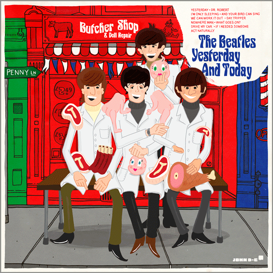
Gallery1988 East In Los Angeles today. The piece is called The Butcher Shop Quartet and is my reinterpretation of The Beatles Yesterday and Today Album with the infamous Butcher cover. The print is a limited edition giclée print you can get a copy from Gallery1988's website here.

The Thirty Three and a Third Exhibition celebrates the art of the album cover, featuring reinterpretations and re-imaginings of existing album covers by artists and designers! When it came time for me to pick what album to illustrate I was stuck. I had a million ideas running through my head, I even lost sleep, mentally going through my record collection thinking of an album to reinterpret. I really wanted to illustrate an album that I not only loved to listen to but that I was also drawn to the cover artwork of. I then began thinking about records and record collecting and albums that I don't own and what would be my holy grail record find based solely on its cover, that's when it hit me….. The Beatles, Yesterday and Today with the now infamous Butcher Cover.


For those of you who don't know the Beatles' U.S. albums differed from the band's U.K. albums in a variety of ways, including different track lists, song mixes, album titles and artwork. In the U.S. the fab four where signed to Capitol Records and especially in the early years they were playing catch-up with the albums and singles that had already come out on the EMI record label in the U.K. Yesterday and Today was released in June 1966 and included tracks from the Beatles' two most recent British LPs which had not yet been included on American albums, plus three from their upcoming LP in the United Kingdom, plus two songs which were back-to-back on a single. At the time The Beatles felt the US releases had undone the hard work that they put into the sequencing of the British versions.


When asked to supply an image for the cover of this album, the band decided to show their dislike of the hodgepodge nature in which Capitol Records compiled their albums by submitting a photograph from an earlier photo shoot by Robert Whitaker. The photographer had the Beatles in the studio for a conceptual art piece titled A Somnambulant Adventure. For the shoot, Whitaker took a series of pictures of the group dressed in butcher smocks and draped with pieces of meat and body parts from plastic baby dolls. The group played along as they were tired of the usual photo shoots and the concept was compatible with their own sense of humour.


Capitol Records originally printed 750 000 covers with the Butcher Cover image. A small fraction were shipped to distributors, disc jockeys and reviewers before its release. A Negative reaction to the cover was immediate and after receiving complaints from some dealers, the record was immediately recalled by Capitol Records prior to its actual release. Although initially ordering the destruction of the Butcher covers, Capitol decided instead to paste a much more conventional cover over the old ones when faced with number of jackets they had already printed. Of course as word of this spread among Beatles Fans, owners of the altered cover attempted, usually unsuccessfully, to peel off the pasted-over cover, hoping to reveal the original image hidden beneath. Eventually, the soaring value and desirability of unpasted-over Butcher covers spurred the development of intricate and complex techniques for peeling the Trunk cover off in such a way that only faint horizontal glue lines remained on the original cover.


I originally chose to reinterpret The Beatles 
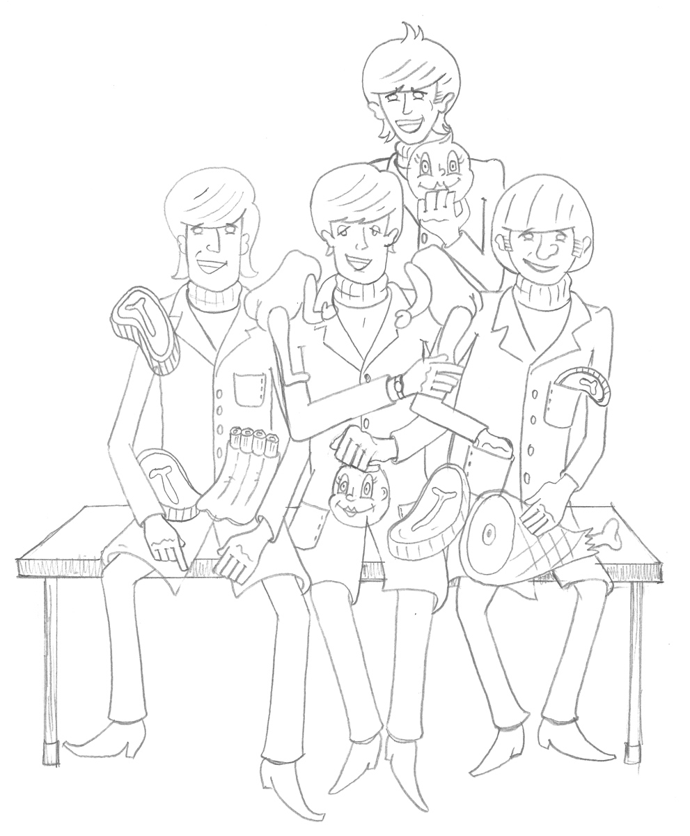
Butcher Cover of the Yesterday and Today Album because of its rarity but it also got me thinking about the power of the album cover. I feel that this cover is a definite precursor to the more artistic and creative album covers of the Beatles' later career, that move away from a simple group shot of the band. When recreating the cover I made it a little less macabre by illustrating it in my retro "story-book style". I really wanted to capture not only the likenesses but also the mannerisms and energy of The Beatles in a very simplified form. I think the final illustration has the feeling of being a children's sing along album which is funny when you think back to its original release and the controversy that followed. Rather than having the band sitting is a blank studio I decided to emphasize the humour and surrealism of the original photograph having The Beatles sitting outside a Butcher and Doll Repair Shop. I also decided to get a bit self referential placing this Butcher and Doll Repair Shop on Penny Lane right next door to the famed barber shop. The Thirty Three and a Third Exhibition exhibition will run until the 21st of December at Gallery1988 East In Los Angeles.

Wednesday, November 19, 2014

Thirty Three and a Third and a Third Exhibition

I have some very, very exciting news I have been selected to have an illustration of mine in the Thirty Three and a Third and a Third Exhibition at the wonderful Gallery1988 East In Los Angeles this December.


The exhibition celebrates the art of the album cover, featuring reinterpretations and re-imaginings of existing album covers by artists and designers!

I won't give away what album I have done just yet - but I will say a sneak peak of it features on the flyer above. If you are in LA this December you've gotta check this exhibition out it's sure to be fantastic! The exhibition will run from the 5th until the 21st of December.

Saturday, April 19, 2014

Secret 7" Exhibition-Record Store Day 2014.

Happy Record Store Day 2014 everyone! It gives me great pleasure to finally reveal that a piece of artwork I designed was selected to be a part of the great Secret 7" initiative.

Secret 7" is an annual event that combines music and art for a good cause. Secret 7" take seven songs from seven well known musicians and press each one 100 times, inviting creatives from around the world to interpret the tracks in their own style, resulting in a one-of-a-kind sleeve for every 7”. The unique pieces of art were exhibited anonymously at Mother London Gallery in London before going on sale this Record Store Day. The proceeds from the event go to the War Child charity.
My design (seen above) was for the classic T. Rex track Get It On. Marc Bolan is one of my favorite artists I love the work he did as T. Rex in the 70's and feel so lucky to have had my artwork selected to represent this track. Get It On was released in 1971 it spent weeks at #1 and went on to sell millions around the world becoming a glam rock anthem. It’s taken from the album Electric Warrior.
I used a photo I took of a mirror ball exploding with light to represent the colourful excesses of the glam rock pioneer, T. Rex. When designing the cover I wanted to use a similar colour palate and treatment that was used on the original cover of the Electric-Warrior album, designed by British art design group Hipgnosis (see my photo of the original cover below).


I am including some pictures from the exhibition opening taken by the folks at Secret 7".

Tuesday, January 14, 2014

Do The Sausage Dance! - Limited Edition Print


I created this illustration for Sweets Workshop's Annual Food Fight Exhibition and Publication. The 2013 theme was The Festive Feast and what's more festive than a group of sausages having a dance! I've actually had a simple sketch of this design sitting in a sketch book for a few years now so it was great to have such a wonderful excuse to turn it into finished art.


The Posters are of a limited edition size of 100 and are all hand numbered by me. You can pick up a copy here.

Monday, June 17, 2013

Mego Museum - Custom of the Week

I was recently lucky enough to have my Pack of Heroes action figures awarded Custom of the Week over on the Mego Museum website and message board.


 EMCE Hammer, Board Moderator wrote:
"There has been a ton of great stuff posted in the past three weeks or so. The Pack of Heroes set by John D-C really jumped out at me, both for creativity involved as well as the execution. These figures just have a neat vibe to the. I'd probably buy them on sight on appearance alone."

As a long time Mego fan and collector, its safe to say I was pretty chuffed by this recognition of my work!

For those of you that don’t know, The Mego Corporation was a toy company that dominated the action figure toy market during most of the 1970s. The Mego Corporation was founded in the early 1950s and was mostly known prior to 1971 as a producer of dime store toys. Starting in 1971, Mego began purchasing license rights to a variety of successful motion pictures, television programs, and  comic books, and started producing lines for Planet of the Apes, Star Trek, and the Wizard of Oz. Mego used various licensed Marvel and DC superhero characters to create their World’s Greatest Superhero line, which became their most successful toy line. They also produced an original character, Action Jackson, an unsuccessful competitor of Hasbro’s G.I. Joe. The secret of Mego’s success was that their action figures were constructed with interchangeable heads. Generic bodies could be mass produced and different figures created by interposing different heads and costumes on them. Mego also constructed their figures primarily in an 8-inch (200mm) scale - setting an industry standard in the 1970s.

I prefer to customise using the Mego’s 8-inch figures for a few reasons, firstly I love them as a base because you can really go crazy with the cloth costuming secondly they have a very classic look to them, and thirdly there is a really established community around customizing Mego Action Figures and it is pretty easy to purchase reproduction parts and accessories.

Wednesday, June 12, 2013

Pack of Heroes - Exhibition Opening Video!


Here is a video I put together from the opening of the Pack of Heroes exhibition. It features a brief chat with the game's creator Phil Walker-Harding and me. You can still support the game over at Kickstarter http://www.kickstarter.com/projects/1425721404/pack-of-heroes-a-superhero-card-game

Also if you haven't made it into Sweets Workshop to see the exhibition yet it has just been extended until the 25th of June.
 

Thursday, June 6, 2013

Pack of Heroes - In The Press


Pack of Heroes was featured in a great article in the Inner West Courier, on Tuesday the 4th of June 2013. Big thanks to Lauren Murada for writing such a fantastic article and Simon Cocksedge for taking such a great Photo. If you haven't checked out the exhibition yet its on until the 18th of June at Sweets Workshop.

Photo © Simon Cocksedge

Monday, May 27, 2013

Pack of Heroes - The Commercial


Here is the finished faux commercial for the Pack of Heroes Action Figures! We were definitely looking to toy commercials from the 1970's and 80's for a little inspiration. Big thanks to Phil Walker-Harding from Adventureland Games for filming and editing this video.

Sunday, May 26, 2013

Pack of Heroes - The Custom Mego Style Action Figures

With further ado here is a detailed look at the finished series of custom-made Pack of Heroes action figures! Zombie Lad, Trash A Tron, Big Walt, Doc Feelgood, The Clown Father and Flamingal.
For comparison here is the group in illustrated form.

Of course ever good action figure needs their own clamshell packaging!

As featured in the Pack of Heroes Exhibition.

Pack of Heroes - Making The Custom Mego Style Action Figures

Part way into the process of illustrating Pack of Heroes, I really wanted to have some 3 dimensional representations of a few of the characters I was busily creating. Customizing action figures is one of my favorite hobbies and I was itching to make a series of one-of-a-kind, custom-made, Mego style Pack of Heroes action figures. I also thought they would be great to feature in the exhibition and promo video for the project on Kickstarter adding to the idea that the heroes in the game were a group of comic book characters that have been appearing in their own comic books and merchandise for a number of years.


The above group of photos detail my progress creating the Doc Feelgood Action Figure.
I really wanted to pull out all stops with Doc Feelgood (and Big Walt) and created an all new Mego styled body which was a hybrid of the standard and muscular bodies from Classic TV Toys. I really like the chest and arms of the muscular body, as they are a more beefy and Superhero-like than the standard body, especially when the character isn't wearing a shirt but I feel the legs and feet are a tad too hulky and don't lend themselves well to wearing shoes or standard mego sized pants. I started by removing the legs of both bodies before cutting down the hip portion of a standard body to insert and glue inside the lower portion of the muscular body (as seen in the top right photo) creating a smaller hip socket to snugly hold the smaller ball joint of the standard legs. The rest of the photos show the decoration of Doc Feelgood, from his blue star shaped chest hair to his custom made spandex pants.
 

In this group of photos I was creating a custom action figure of Zombie Lad! He is my personal favorite of all the Pack of Heroes characters and I really wanted to do the drawing justice and give him a few skeletal limbs. For this I once again used two Classic TV Toys bodies this time the standard body in blue and the skeleton. Combining the two took a little bit of sawing, drilling and gluing, but I was really happy with the results, the boney leg really gives him a great zombie like lurch. I wanted the head to have a real 1970's charm so Zombie Lad looked like he could have been part of Mego's Mad Monster Line. I used a cast of the 1963 Phantom of the Opera Aurora Model head by Dr Mego as a base and then sculpted on some hair and Zombie Lad's trademark curl. The addition of a few paint apps really bought the head to life....or death.

Tuesday, May 21, 2013

The Opening of Pack of Heroes - The Exhibition

Here are a few photos from the opening of my exhibition, Pack of Heroes at Sweets Workshop! The exhibition featured the artwork that I've created for an up-and-coming card game by Adventureland Games.


If you didn't make it to the opening, the exhibition runs until the 18th of June so you still have heaps of time to check it out. Also if you liked what you saw and wanna get copy of the game as well as bragging rights for helping it get produced it is now up on kickstarter so head on over to www.packofheroes.com and follow the link!


I Would also love to thank my wonderful and super supportive friends and family who came out to the exhibition opening on Saturday. I really appreciate your support and it was fabulous to finally show you what I've spent most of this year working on!

This is me with Pack of Hero's Game Designer Phil Walker-Harding

Saturday, May 11, 2013

Pack of Heroes - The Exhibition

Yes, you read correctly my Illustration and Graphic Design work for the up-and-coming superhero card game, Pack of Heroes is going to be featured in its own art exhibition.

When:  May 18th - June 18th

Official Opening: 2pm Sat May 18th. Come down to meet the creators of the game and even have a play of the game before its release!

Where: Sweets Workshop, Shop 4, 58-60 Carlton Crescent, Summer Hill, NSW Australia 2130
More Information: Pack of Heroes has been developed by local Summer Hill game designer Phil Walker-Harding of Adventureland Games (www.adventurelandgames.com) with characters and artwork by Sweets Workshop's very own John D-C (www.johnd-c.com).

Pack of Heroes is an action packed card game where players control a team of comic book superheroes and battle it out in a quest to gain control of Power City.

The Exhibition will unveil 30 brand new superhero characters that John D-C has illustrated for the game as well as feature a behind the scenes look into the development process of the game.


Friday, May 10, 2013

A Whole Mess of Megos!


This kinda mess can only mean one thing.... Yep, I'm getting for another exhibition.

Wednesday, May 2, 2012

Secret 7" Selection! YAY!

With Record Store Day 2012 behind us I can finally reveal that one of the pieces of artwork I designed and submitted to Tanlenthouse's great initiative, Secret 7" was successfully selected. My design entitled "It's a Wonderful Surprise" was hand picked by non-other than The Cure's Robert Smith to be one of the 7" record sleeves for a special release of Friday I'm In Love.

My artwork was produced into an actual one-of-a-kind 7" record sleeve and was on display at the Idea Generation Gallery in Shoreditch, London where it was purchased by a mystery buyer (who has impeccable artistic taste, If I do say so myself). Every penny profited from the sale of the exclusive vinyl records went to the Teenage Cancer Trust charity.


I am including some pictures of the exhibition opening taken by the folks at Secret 7" Big thanks to Kevin King for giving me permission to use the pics.


You can read more about my original submissions and the Secret 7" project  here.